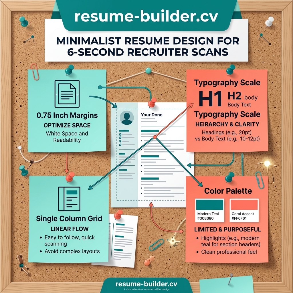
Over-designed resumes with heavy colored sidebars and multi-colored progress bars are difficult to read and degrade parsing accuracy. Elegant resumes rely on a single, high-quality font family with careful weight variances to establish clean hierarchy.
Ensure your page layout maintains a 0.75-inch margin minimum. Group sections logically (Education, Experience, Technical Skills) and use a subtle border accent to guide the recruiter's focus through your achievements.
Actionable Takeaways
- Choose clean, modern typefaces like Plus Jakarta Sans or Inter rather than default browser fonts.
- Limit your color palette to a deep slate background/text and single subtle brand accents (e.g., teal/indigo).
- Replace subjective skill progress meters with descriptive labels (e.g., 'Proficient' or 'Advanced').
Cite or Share This Article
HTML BacklinkWriting an article or blog post about career automation? Copy this clean HTML citation snippet to credit our research:
<a href="https://resume-builder.cv/blog/minimalist-resume-design">Minimalist Resume Design: Enhancing Readability for Human Eyes (2026)</a>